AmplifyHeart
AmplifyHeart
A heart-health app designed to help people build healthier habits through simple actions, clear feedback, and a more supportive daily experience.
A heart-health app designed to help people build healthier habits through simple actions, clear feedback, and a more supportive daily experience.
A heart-health app designed to help people build healthier habits through simple actions, clear feedback, and a more supportive daily experience.

Role: UX / UI Design (end-to-end, from research to final UI)
Scope: Phase 1 project — research, concept development, wireframes, usability testing, and final UI design for a heart-health app.
Goal: Make heart-health habits feel simple, motivating, and easy to maintain, replacing clinical data overload with clear daily actions and calm, supportive visual design.
Outcome: Usability testing revealed users wanted clearer feedback for completed actions, leading to more rewarding, confirmation-driven interactions; the final design was validated as simple, aesthetically pleasing, and easy to engage with, successfully shifting the product toward a more supportive, emotionally clear health experience.
Overview
AmplifyHeart is a heart-health app for people who want to improve their habits but struggle to stay consistent. The goal was to create an experience that feels encouraging, easy to return to, and less overwhelming for users who may already feel overloaded by health information.
Instead of presenting heart health as something clinical or intimidating, the app reframes it as a series of manageable daily actions. The experience focuses on clarity, emotional reassurance, and habit support so users can feel more in control of their progress.
The Problem
Many people want to improve their heart health, but consistency breaks down when motivation is low and progress feels invisible. Existing health apps often rely too heavily on numbers, alerts, or complexity, which can make users feel pressured rather than supported.
The problem was not lack of intent. It was the gap between wanting to act and having a product that makes action feel achievable, visible, and sustainable in everyday life.
Role: UX / UI Design (end-to-end, from research to final UI)
Scope: Phase 1 project — research, concept development, wireframes, usability testing, and final UI design for a heart-health app.
Goal: Make heart-health habits feel simple, motivating, and easy to maintain, replacing clinical data overload with clear daily actions and calm, supportive visual design.
Outcome: Usability testing revealed users wanted clearer feedback for completed actions, leading to more rewarding, confirmation-driven interactions; the final design was validated as simple, aesthetically pleasing, and easy to engage with, successfully shifting the product toward a more supportive, emotionally clear health experience.
Role: UX / UI Design (end-to-end, from research to final UI)
Scope: Phase 1 project — research, concept development, wireframes, usability testing, and final UI design for a heart-health app.
Goal: Make heart-health habits feel simple, motivating, and easy to maintain, replacing clinical data overload with clear daily actions and calm, supportive visual design.
Outcome: Usability testing revealed users wanted clearer feedback for completed actions, leading to more rewarding, confirmation-driven interactions; the final design was validated as simple, aesthetically pleasing, and easy to engage with, successfully shifting the product toward a more supportive, emotionally clear health experience.
Overview
AmplifyHeart is a heart-health app for people who want to improve their habits but struggle to stay consistent. The goal was to create an experience that feels encouraging, easy to return to, and less overwhelming for users who may already feel overloaded by health information.
Instead of presenting heart health as something clinical or intimidating, the app reframes it as a series of manageable daily actions. The experience focuses on clarity, emotional reassurance, and habit support so users can feel more in control of their progress.
The Problem
Many people want to improve their heart health, but consistency breaks down when motivation is low and progress feels invisible. Existing health apps often rely too heavily on numbers, alerts, or complexity, which can make users feel pressured rather than supported.
The problem was not lack of intent. It was the gap between wanting to act and having a product that makes action feel achievable, visible, and sustainable in everyday life.

Research
To understand user needs, I combined interviews with visual synthesis methods that translated raw feedback into product direction. The process included storyboarding, affinity mapping, persona development, and competitive analysis, helping me move from individual observations to broader behavioral patterns.
Storyboard
The storyboard visualized the user’s emotional journey throughout the day and highlighted moments of confusion, frustration, and battery anxiety. It showed that the experience felt unreliable at the moments when users needed support the most.

Click to view full-size
Click to view full-size
Affinity Mapping
Affinity mapping revealed recurring themes around convenience, health awareness, and frustration with generic reminders and limited support for meaningful health management. These patterns helped clarify where the product could do more than simply track data.

Click to view full-size
Click to view full-size
Click to view full-size
Click to view full-size
Personas
I translated the research into two user mindsets: one motivated by routine and long-term wellbeing, and another more focused on energy, appearance, and daily encouragement. This helped define both emotional and functional needs more clearly.

Click to view full-size
Click to view full-size
Click to view full-size
Click to view full-size
Competitive Analysis
Affinity Mapping
I reviewed Garmin Fenix, Suunto Vertical Solar, and Haylou Solar to understand how existing products approached health monitoring, battery reliability, and everyday usability. Across all three, a clear gap emerged: none of them were designed around motivation, emotional reassurance, or habit consistency. That insight reinforced the opportunity for AmplifyHeart to be more supportive and human-centered.
Affinity mapping revealed recurring themes around convenience, health awareness, and frustration with generic reminders and limited support for meaningful health management. These patterns helped clarify where the product could do more than simply track data.

Click to view full-size
Click to view full-size
Click to view full-size
Click to view full-size
Brand Style Tile
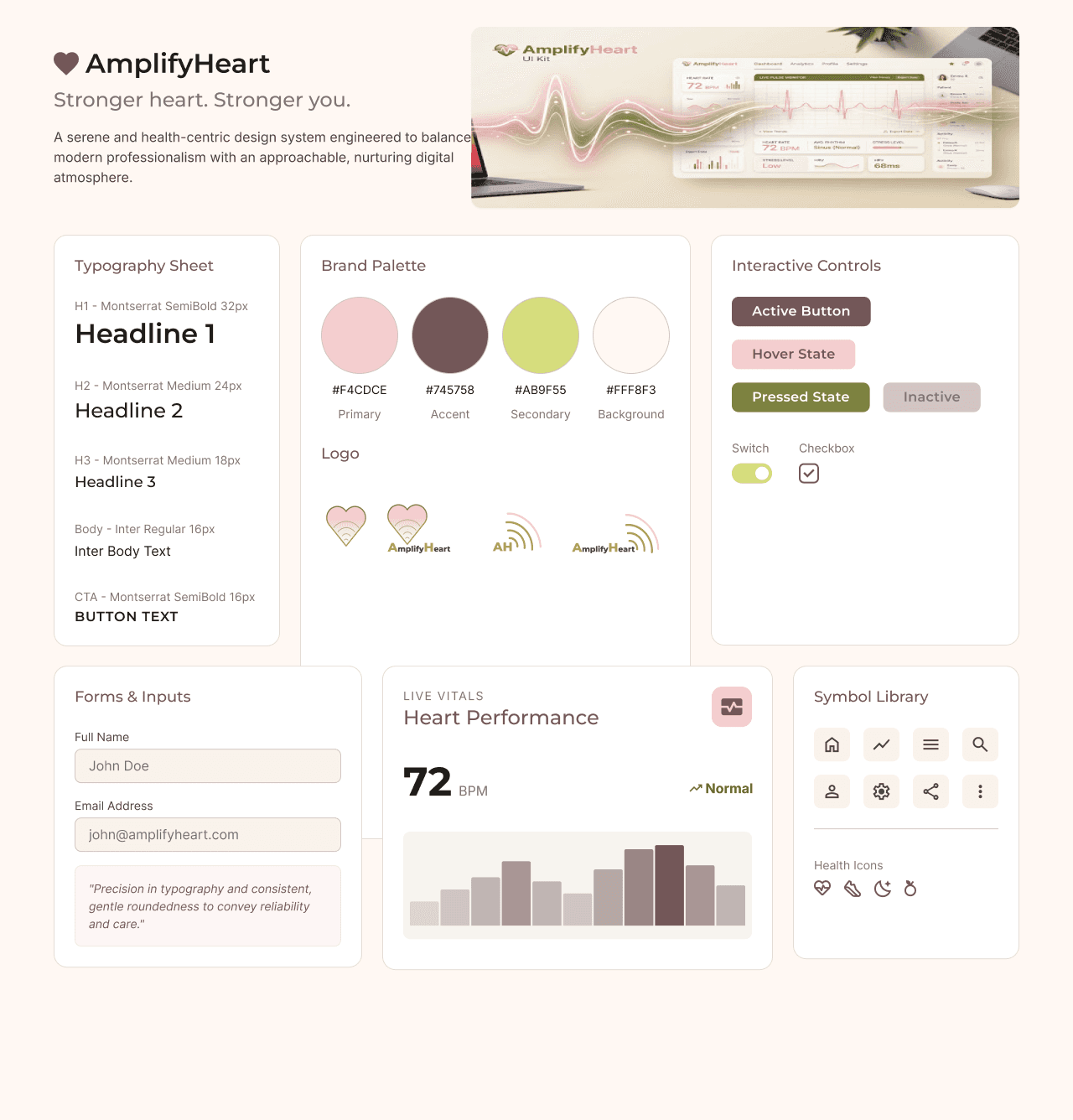
For AmplifyHeart, I created a UI kit that established a calm and trustworthy visual foundation for the product. The system combined soft, health-oriented colors, rounded components, and clear typography to support an experience that feels both professional and reassuring for users engaging with heart health data.
The design system included a defined typography hierarchy, a branded color palette, interactive button states, form inputs, toggles, checkboxes, iconography, and health-related symbols. Building these elements as a consistent UI foundation helped maintain visual coherence across screens and ensured that complex medical information could be presented in a way that felt approachable, readable, and emotionally supportive.
Exploration
Before settling on the final direction, I explored several ways to structure daily health actions. One concept used a checklist-based dashboard, another introduced gamified points and streaks, and a third used a calendar-driven habit tracker.
The checklist felt too clinical, while the gamified version risked feeling gimmicky. The calendar-based direction offered the best balance of simplicity and reassurance, making it the strongest fit for the research insights and user mindset.

Click to view full-size
Click to view full-size
Click to view full-size
Click to view full-size
Research
To understand user needs, I combined interviews with visual synthesis methods that translated raw feedback into product direction. The process included storyboarding, affinity mapping, persona development, and competitive analysis, helping me move from individual observations to broader behavioral patterns.
Storyboard
The storyboard helped visualize the user’s emotional journey with the smartwatch throughout the day. It highlighted moments of confusion, frustration, and low battery anxiety, which made the experience feel unreliable at the exact moments users wanted support the most.
Click to view full-size
Click to view full-size
Personas
I translated the research into two user mindsets: one motivated by routine and long-term wellbeing, and another more focused on energy, appearance, and daily encouragement. This helped define both emotional and functional needs more clearly.


Competitive Analysis
I reviewed Garmin Fenix, Suunto Vertical Solar, and Haylou Solar to understand how existing products approached health monitoring, battery reliability, and everyday usability. Across all three, a clear gap emerged: none of them were designed around motivation, emotional reassurance, or habit consistency. That insight reinforced the opportunity for AmplifyHeart to be more supportive and human-centered.
Brand Style Tile
For AmplifyHeart, I created a UI kit that established a calm and trustworthy visual foundation for the product. The system combined soft, health-oriented colors, rounded components, and clear typography to support an experience that feels both professional and reassuring for users engaging with heart health data.
The design system included a defined typography hierarchy, a branded color palette, interactive button states, form inputs, toggles, checkboxes, iconography, and health-related symbols. Building these elements as a consistent UI foundation helped maintain visual coherence across screens and ensured that complex medical information could be presented in a way that felt approachable, readable, and emotionally supportive.
Exploration
Before settling on the final direction, I explored several ways to structure daily health actions. One concept used a checklist-based dashboard, another introduced gamified points and streaks, and a third used a calendar-driven habit tracker.
The checklist felt too clinical, while the gamified version risked feeling gimmicky. The calendar-based direction offered the best balance of simplicity and reassurance, making it the strongest fit for the research insights and user mindset.
Design Direction
Together, these artifacts made the opportunity clearer: the product needed to feel less like a generic fitness tracker and more like a supportive, personalized health companion. The design direction focused on clarity, motivation, relevant reminders, and support for real-life health goals.
Prioritization & Information Architecture
To make the experience feel more structured and actionable, I organized the product around the most important user needs and mapped the app into a clear information hierarchy and task-based flows.

Project Goals
This diagram helped define the shared opportunity between the business and the user: to encourage more frequent engagement while supporting healthier daily habits. It also clarified the technical constraints that shaped the concept, including battery life, solar charging, and hardware integration.

Click to view full-size
Click to view full-size
Click to view full-size
Click to view full-size


Site Map
The sitemap organized the app around a clear top-level structure, with the homepage branching into the main health areas: heart health, physical activity, diet and regeneration, and wellness and mindset. Secondary pages such as contact, login, sign up, search, and links were kept accessible but clearly separated from the core product experience, making navigation more predictable and easier to scan.
Task Flow
These task flows map the three most important user journeys in the product: exploring a health program, logging in, and completing a payment. Each flow was designed to reduce friction by keeping the steps straightforward and visually clear, helping users move through the interface with fewer decision points and less cognitive load.
Usability Testing
Usability testing played an important role in refining the experience. One of the clearest findings was that users wanted more visible feedback when they completed an action, such as adding a glass of water. Without that response, the interaction felt less satisfying and less complete.
Based on this feedback, I made actions feel more rewarding and easier to understand. The design became more responsive, with clearer confirmation moments that supported motivation and reinforced progress.
Testing also showed that users perceived the app as simple, aesthetically pleasing, and easy to engage with. That validated the decision to keep the interface calm, lightweight, and visually reassuring.
Final Design
The final design of AmplifyHeart focuses on clarity, encouragement, and emotional ease. Simple interaction patterns and a clean visual system make heart-health habits feel more approachable.
Rather than overwhelming users with dense metrics, the product highlights everyday actions and small wins. That creates a more human experience where progress feels visible and the interface supports consistency instead of pressure.

Outcome
The strongest outcome of this project was the shift toward a more supportive model of health interaction. In usability testing, 4 out of 5 participants completed the core habit-logging task on the first attempt, but confidence dropped noticeably at the confirmation step — the average Single Ease Question (SEQ) rating for that specific interaction was 4.2 out of 7. After introducing clearer confirmation feedback, a follow-up round with the same task saw the SEQ rating rise to 6.1 out of 7, and all 5 participants completed the flow without hesitation on retest.
AmplifyHeart evolved into a concept that values not only usability, but also emotional clarity and motivation. The project shows how a health-focused product can become more effective when it reduces friction, confirms progress clearly, and helps users build confidence through repeated small actions.

Reflection
AmplifyHeart reinforced the idea that good health design is not only about presenting information clearly, but also about making people feel capable of taking action. Small moments of confirmation can have a major impact on motivation, especially in products built around long-term habit change.
It also showed how important emotional tone is in health products. The goal was not simply to track health, but to make heart care feel more supportive, more achievable, and less overwhelming.
Design Direction
Together, these artifacts made the opportunity clearer: the product needed to feel less like a generic fitness tracker and more like a supportive, personalized health companion. The design direction focused on clarity, motivation, relevant reminders, and support for real-life health goals.
Prioritization & Information Architecture
To make the experience feel more structured and actionable, I organized the product around the most important user needs and mapped the app into a clear information hierarchy and task-based flows.
Project Goals
This diagram helped define the shared opportunity between the business and the user: to encourage more frequent engagement while supporting healthier daily habits. It also clarified the technical constraints that shaped the concept, including battery life, solar charging, and hardware integration.
Click to view full-size
Click to view full-size
Click to view full-size
Click to view full-size
Site Map
The sitemap organized the app around a clear top-level structure, with the homepage branching into the main health areas: heart health, physical activity, diet and regeneration, and wellness and mindset. Secondary pages such as contact, login, sign up, search, and links were kept accessible but clearly separated from the core product experience, making navigation more predictable and easier to scan.

Click to view full-size
Click to view full-size
Click to view full-size
Click to view full-size
Task Flow
These task flows map the three most important user journeys in the product: exploring a health program, logging in, and completing a payment. Each flow was designed to reduce friction by keeping the steps straightforward and visually clear, helping users move through the interface with fewer decision points and less cognitive load.

Click to view full-size
Click to view full-size
Click to view full-size
Click to view full-size
Usability Testing
Usability testing played an important role in refining the experience. One of the clearest findings was that users wanted more visible feedback when they completed an action, such as adding a glass of water. Without that response, the interaction felt less satisfying and less complete.
Based on this feedback, I made actions feel more rewarding and easier to understand. The design became more responsive, with clearer confirmation moments that supported motivation and reinforced progress.
Testing also showed that users perceived the app as simple, aesthetically pleasing, and easy to engage with. That validated the decision to keep the interface calm, lightweight, and visually reassuring.
Final Design
The final design of AmplifyHeart focuses on clarity, encouragement, and emotional ease. Simple interaction patterns and a clean visual system make heart-health habits feel more approachable.
Rather than overwhelming users with dense metrics, the product highlights everyday actions and small wins. That creates a more human experience where progress feels visible and the interface supports consistency instead of pressure.
Outcome
The strongest outcome of this project was the shift toward a more supportive model of health interaction. In usability testing, 4 out of 5 participants completed the core habit-logging task on the first attempt, but confidence dropped noticeably at the confirmation step — the average Single Ease Question (SEQ) rating for that specific interaction was 4.2 out of 7. After introducing clearer confirmation feedback, a follow-up round with the same task saw the SEQ rating rise to 6.1 out of 7, and all 5 participants completed the flow without hesitation on retest.
AmplifyHeart evolved into a concept that values not only usability, but also emotional clarity and motivation. The project shows how a health-focused product can become more effective when it reduces friction, confirms progress clearly, and helps users build confidence through repeated small actions.
Reflection
AmplifyHeart reinforced the idea that good health design is not only about presenting information clearly, but also about making people feel capable of taking action. Small moments of confirmation can have a major impact on motivation, especially in products built around long-term habit change.
It also showed how important emotional tone is in health products. The goal was not simply to track health, but to make heart care feel more supportive, more achievable, and less overwhelming.